The challenge was to transform a backend manufacturing legacy into a brand.
The parent brand, Vardhaman Carpets, came with years of expertise, but no distinct identity in the retail segment. It operated behind the scenes, creating and exporting rugs but without building recognition for itself, within the category.
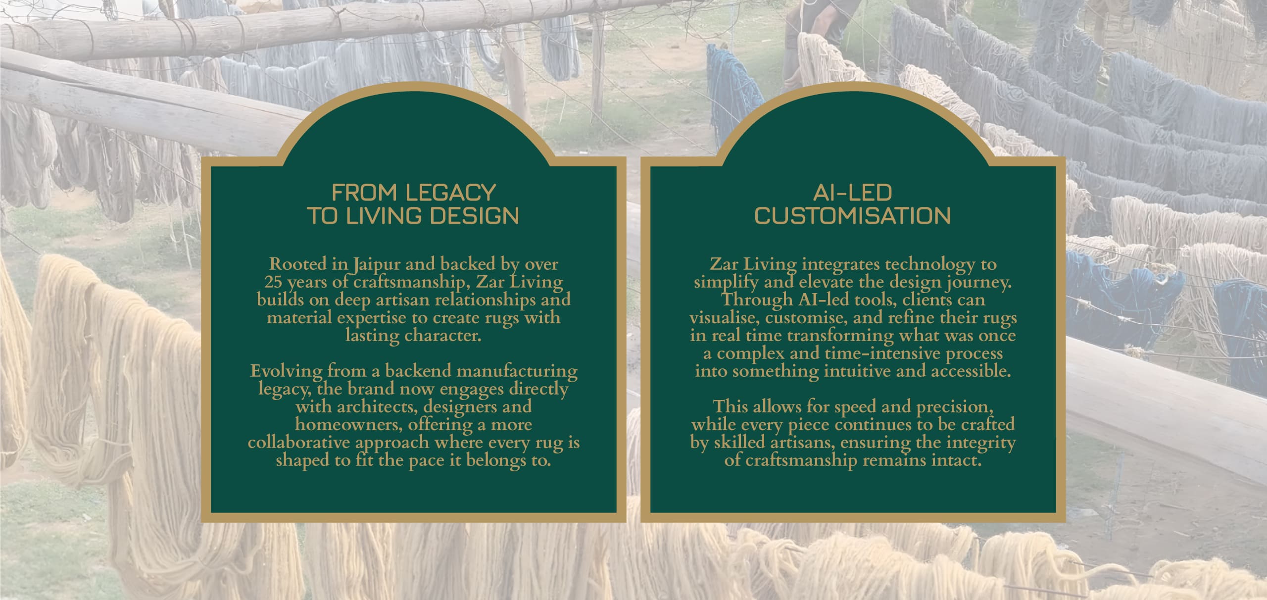
The task was to bring this depth to the forefront and position Zar Living as a brand that could engage directly with architects, designers and homeowners, not just as a supplier, but as a creative partner.
This meant building a narrative and identity that felt contemporary and premium, while still rooted in craftsmanship. At the same time, the brand needed to introduce a new way of thinking about rugs, shifting from fixed offerings to a more personalised, design driven approach enabled by technology.
Goal
The goal was to position Zar Living as a rug brand, one that redefines how rugs are imagined and created.
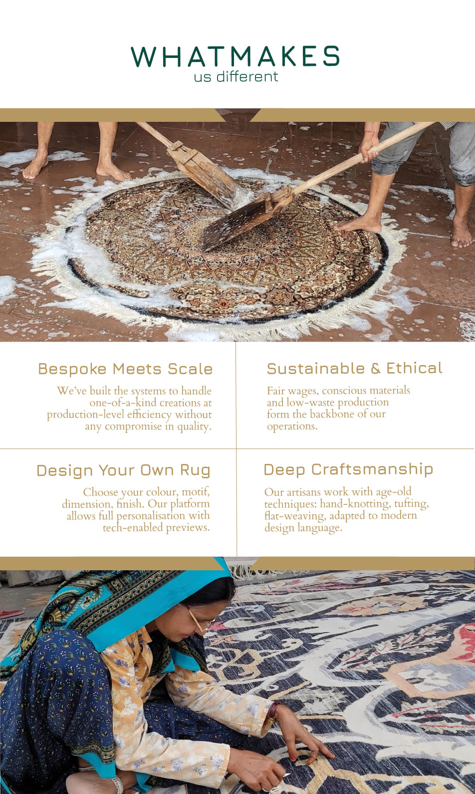
We set out to build a brand that balances three worlds seamlessly: heritage craftsmanship, modern aesthetics and technological ease.
This meant defining a clear point of view, crafting a distinctive identity system and creating a narrative that positions Zar Living as not just a product offering, but a platform for creative expression, where every piece begins with the user’s imagination.
Result
Zar Living now operates with a clearly defined identity that reflects both its legacy and its new direction.
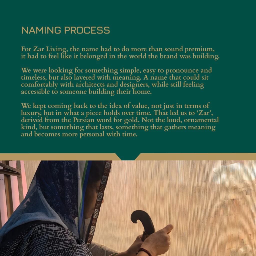
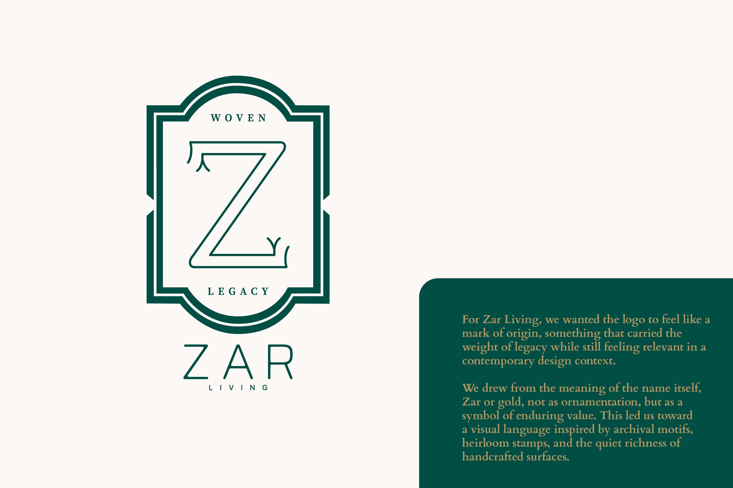
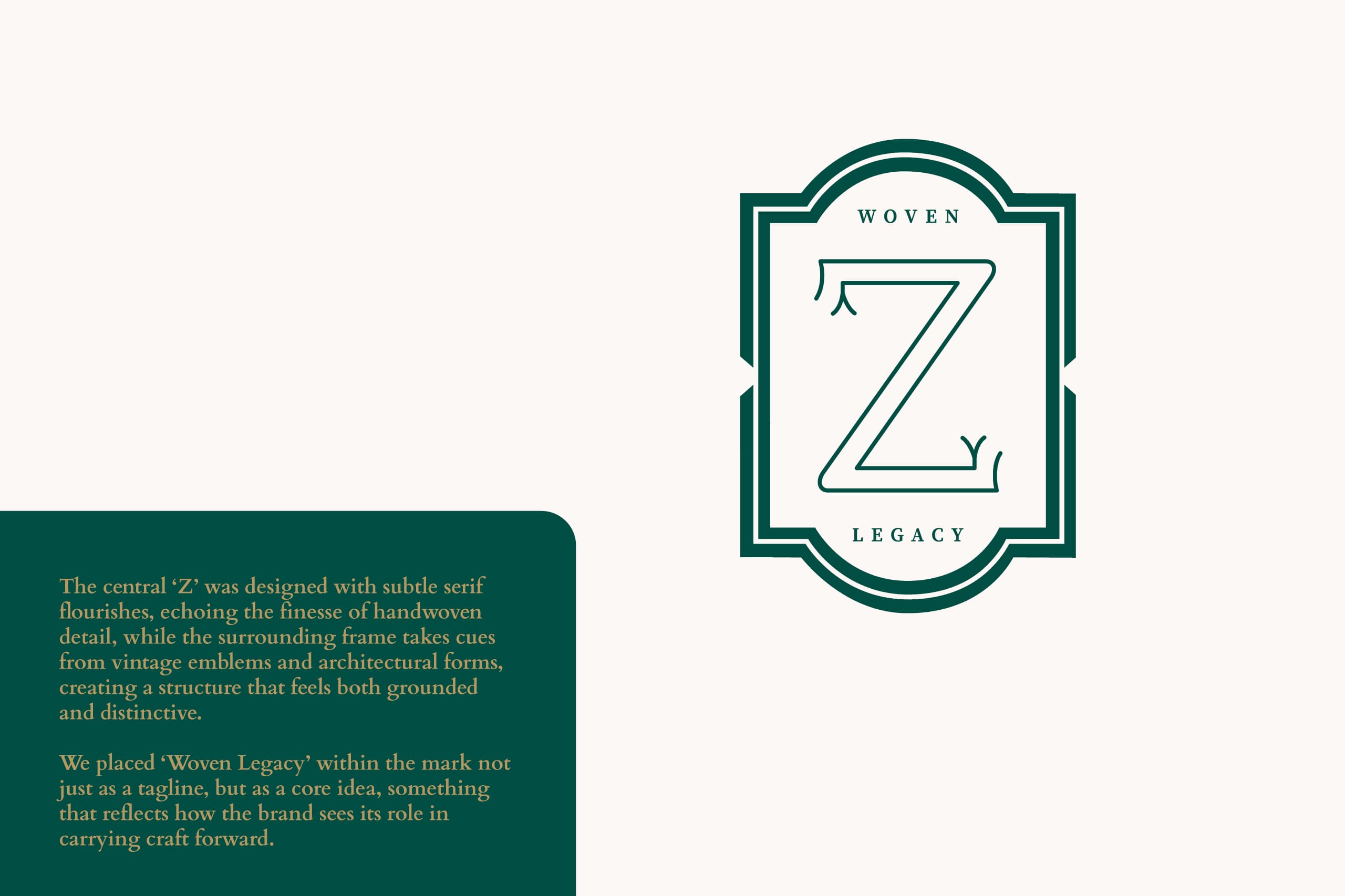
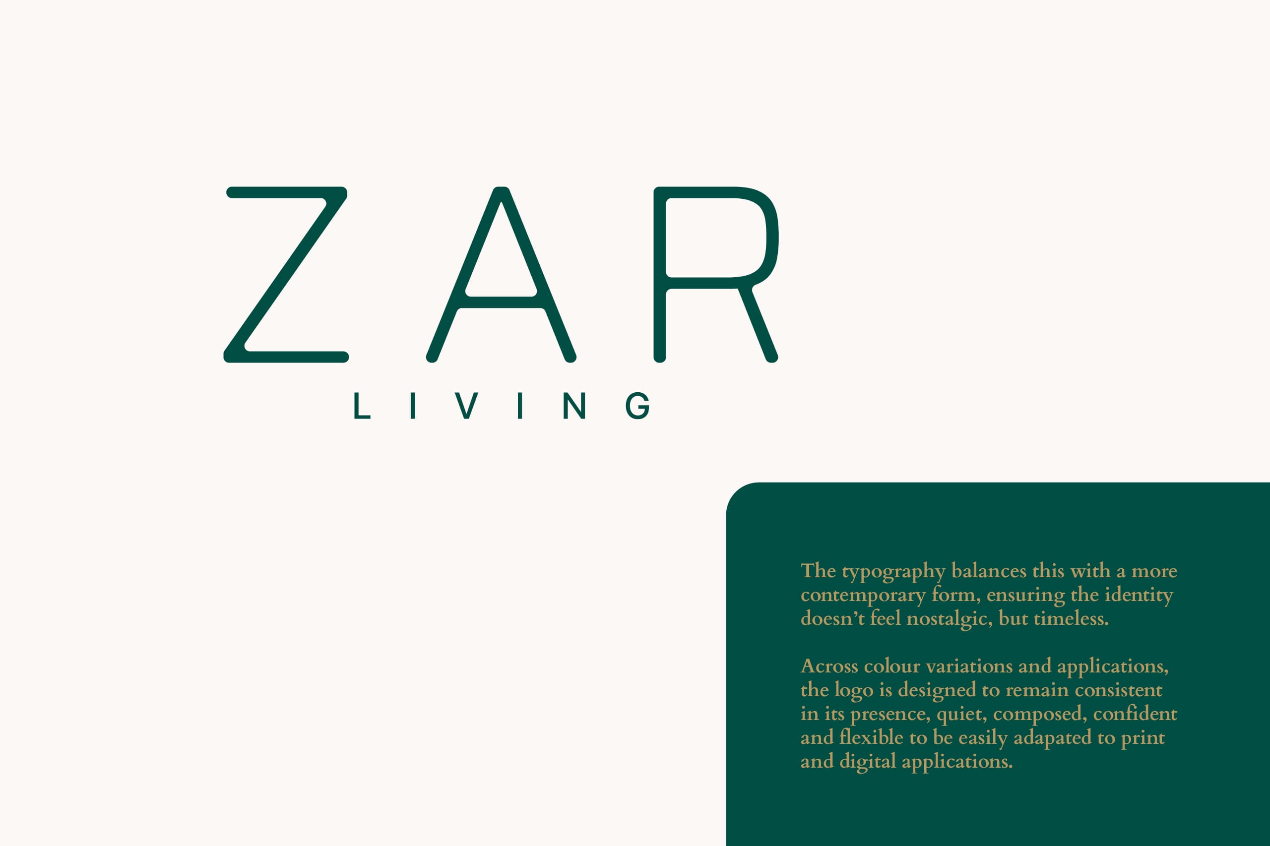
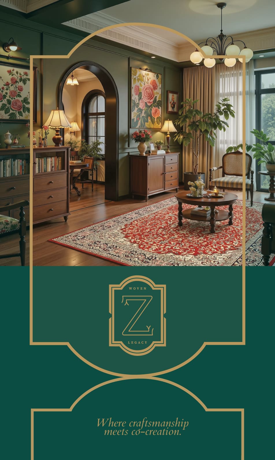
A key shift began with naming the brand itself, moving from a backend entity to Zar Living, a name that captures value, timelessness and everyday relevance, while remaining simple, memorable and globally accessible.
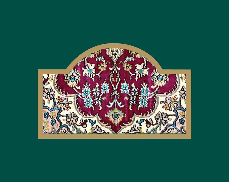
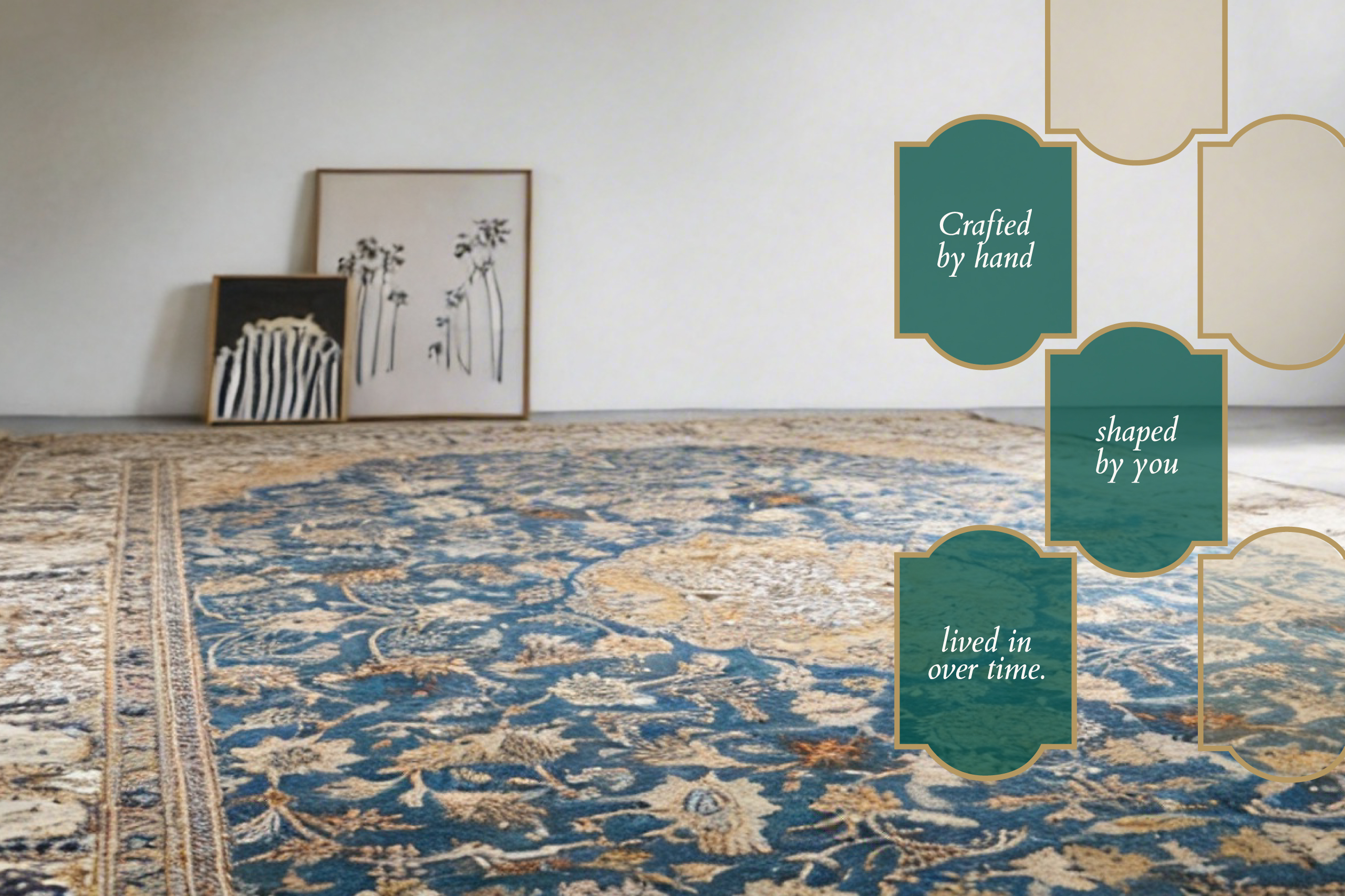
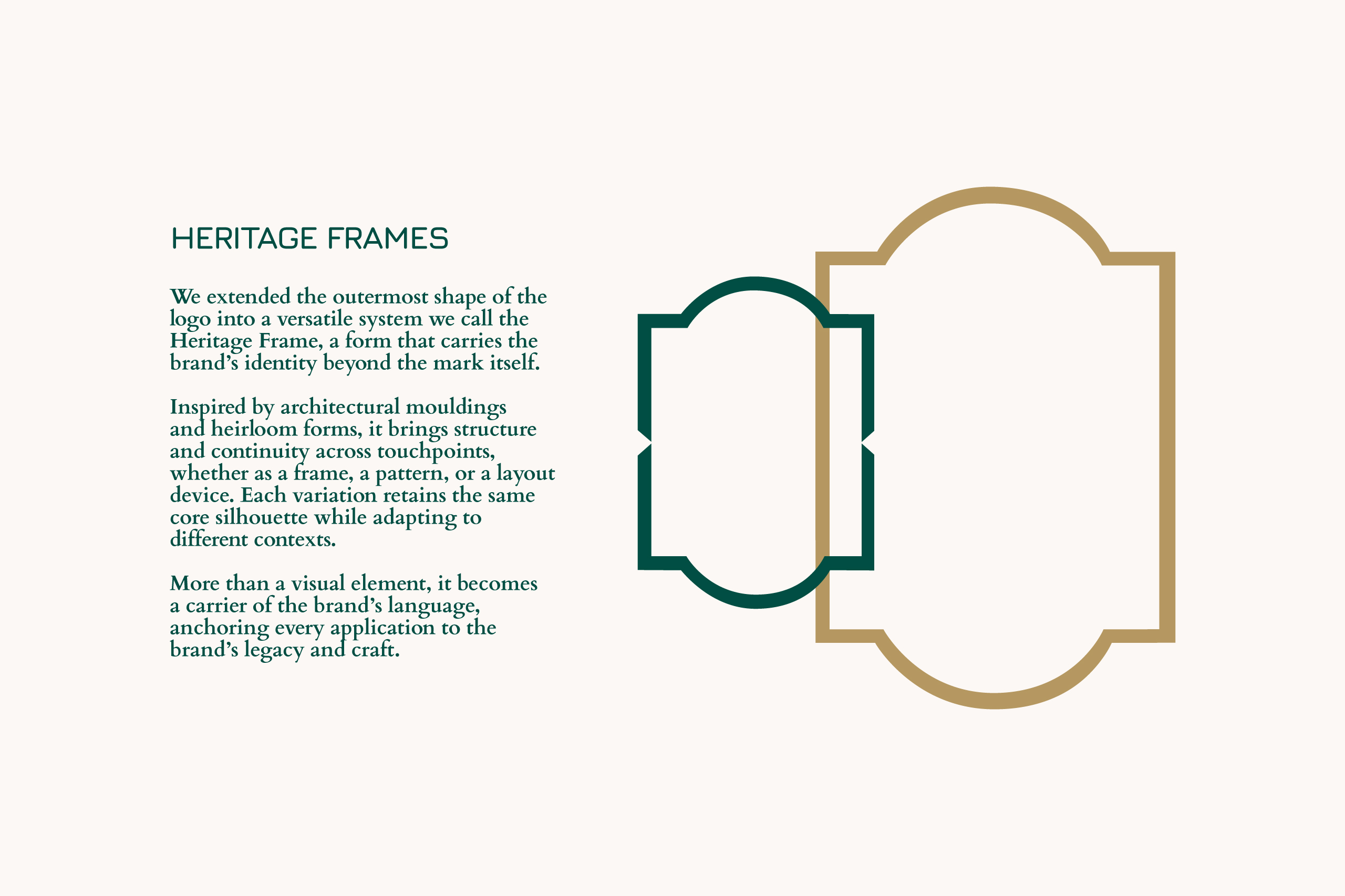
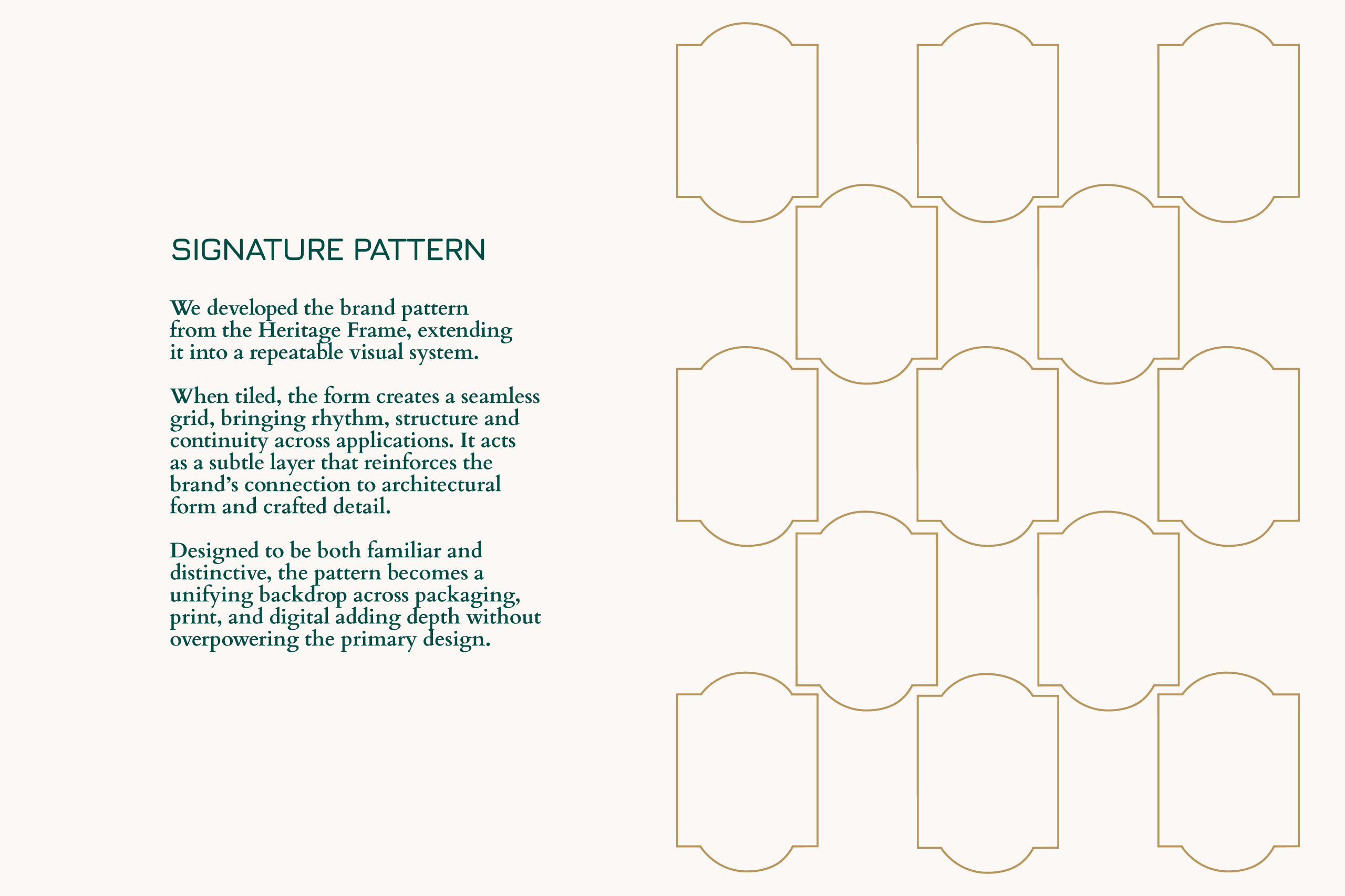
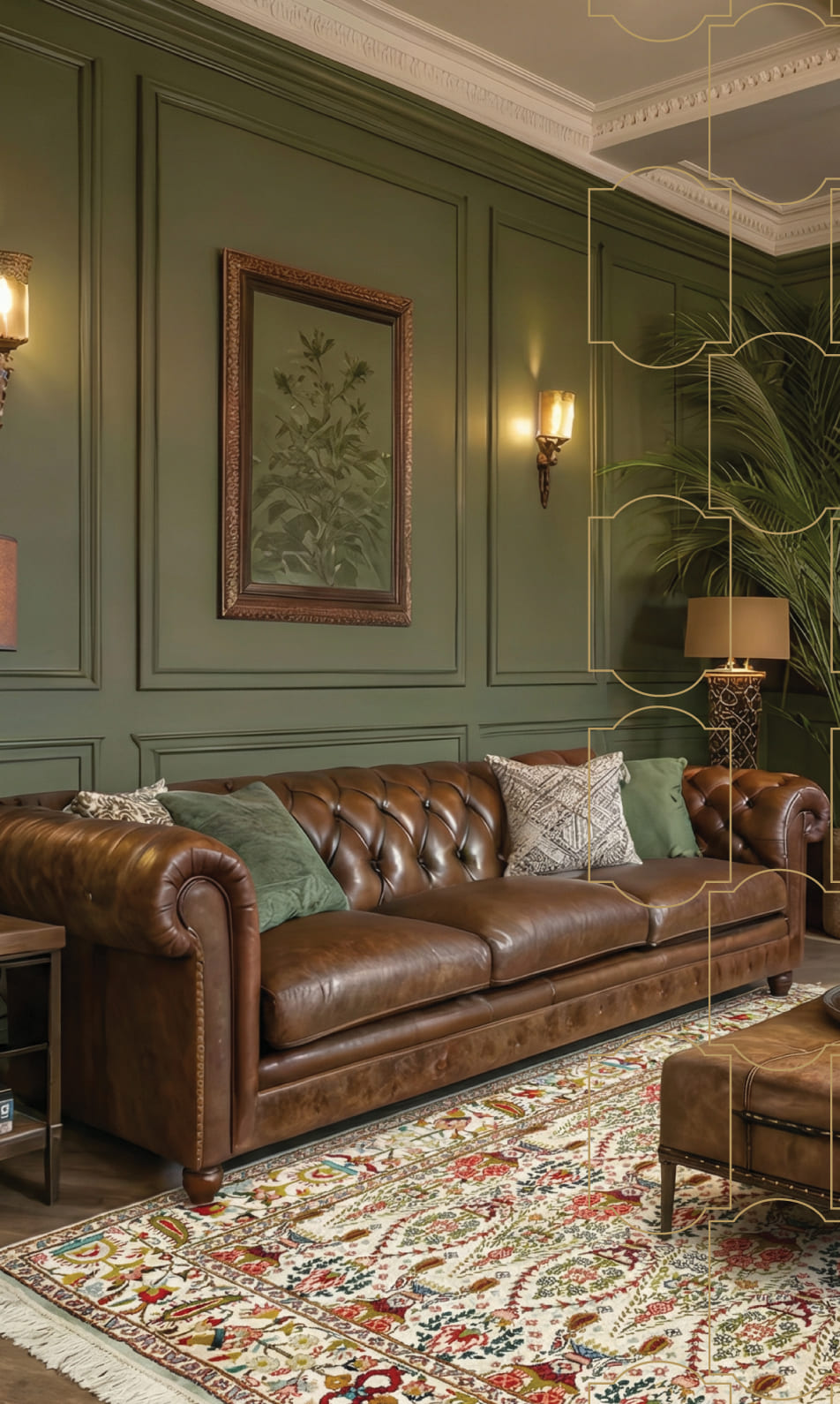
Building on this, we developed a distinctive visual system centred around the logo, monogram and the Heritage Frame, extended into patterns, layouts and collateral to create a consistent and recognisable language across touchpoints.
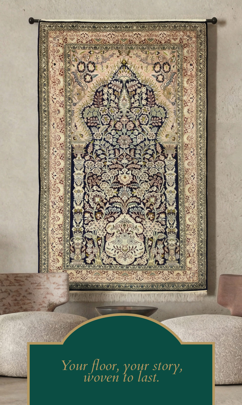
The identity balances structure and softness, clean typography with detailed forms, deep colour palettes with subtle contrast, allowing the brand to feel premium without being overpowering.
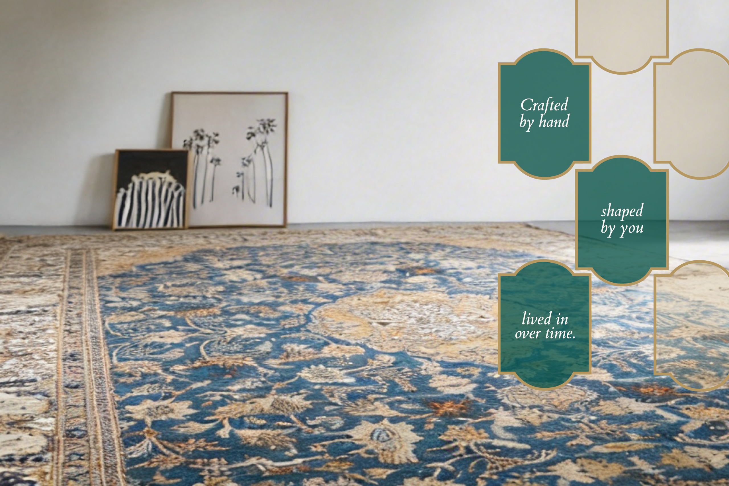
Beyond visuals, the brand clearly communicates a shift from selection to customisation. Every touchpoint reinforces the idea of co-creation, making the offering immediately understandable and differentiated.