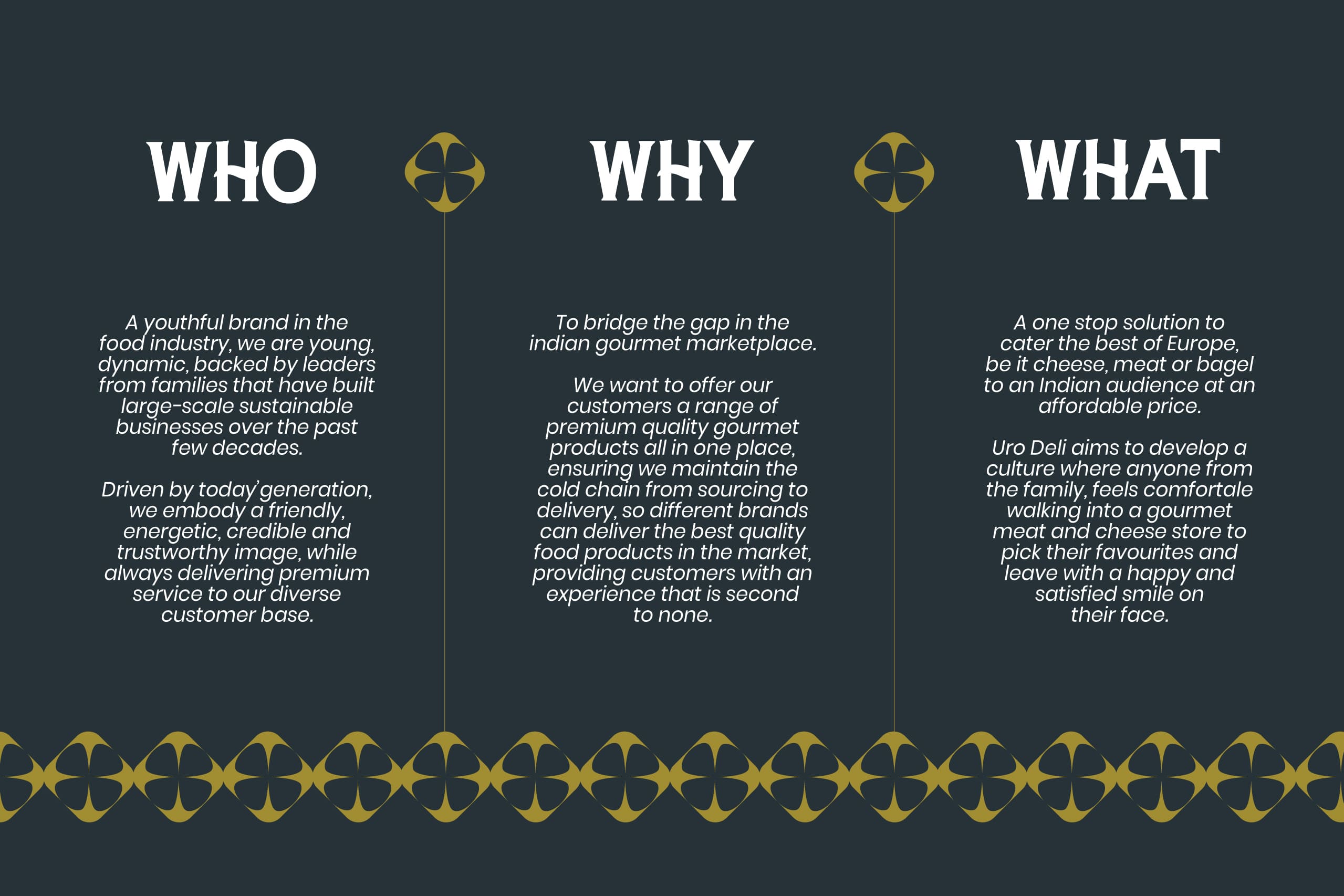
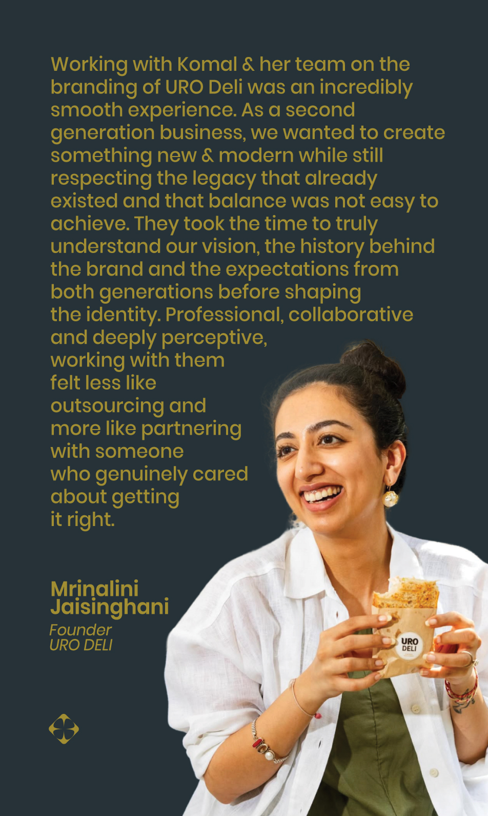
The challenge was to evolve an identity that allowed the second generation to build a brand of their own, while preserving the trust, credibility and legacy established by the first.
Uro by Meatzza, the parent company, already held strong recognition in the retail market, with a logo that carried deep emotional and legacy value. As the second generation stepped into the business, they wanted to shape a brand that reflected their vision and connected with a more modern consumer.
The task, therefore, was not to replace what existed, but to carefully evolve it. The identity needed to feel fresh and forward-looking for the next generation to lead, while remaining familiar enough for the first generation to stand behind, ensuring the brand honoured its past while confidently preparing for its future.
Goal
The goal was to create a distinct identity for Uro Deli that could stand independently while still honouring its roots.
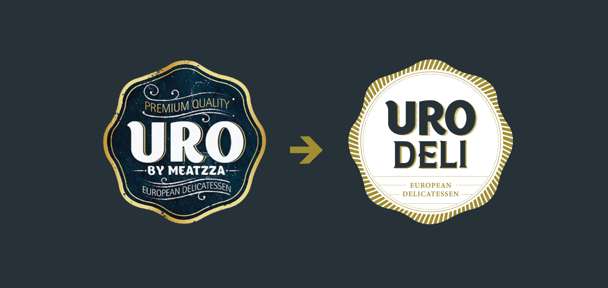
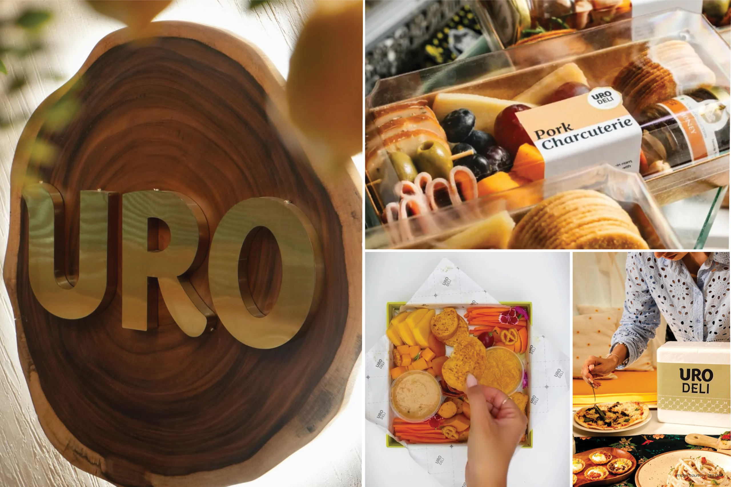
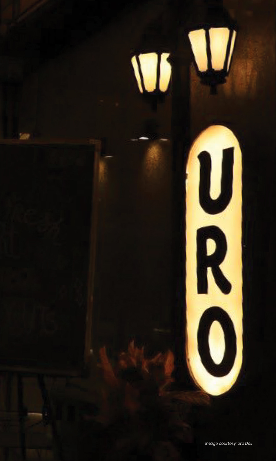
To honour the brand’s legacy, we began by carefully evolving the existing logo rather than replacing it. The ‘URO’ from the original mark was subtly refined to retain familiarity, while the ‘Deli’ wordmark was given greater weight and character allowing it to emerge as the hero of the new identity. This balance became the anchor for the entire brand system.
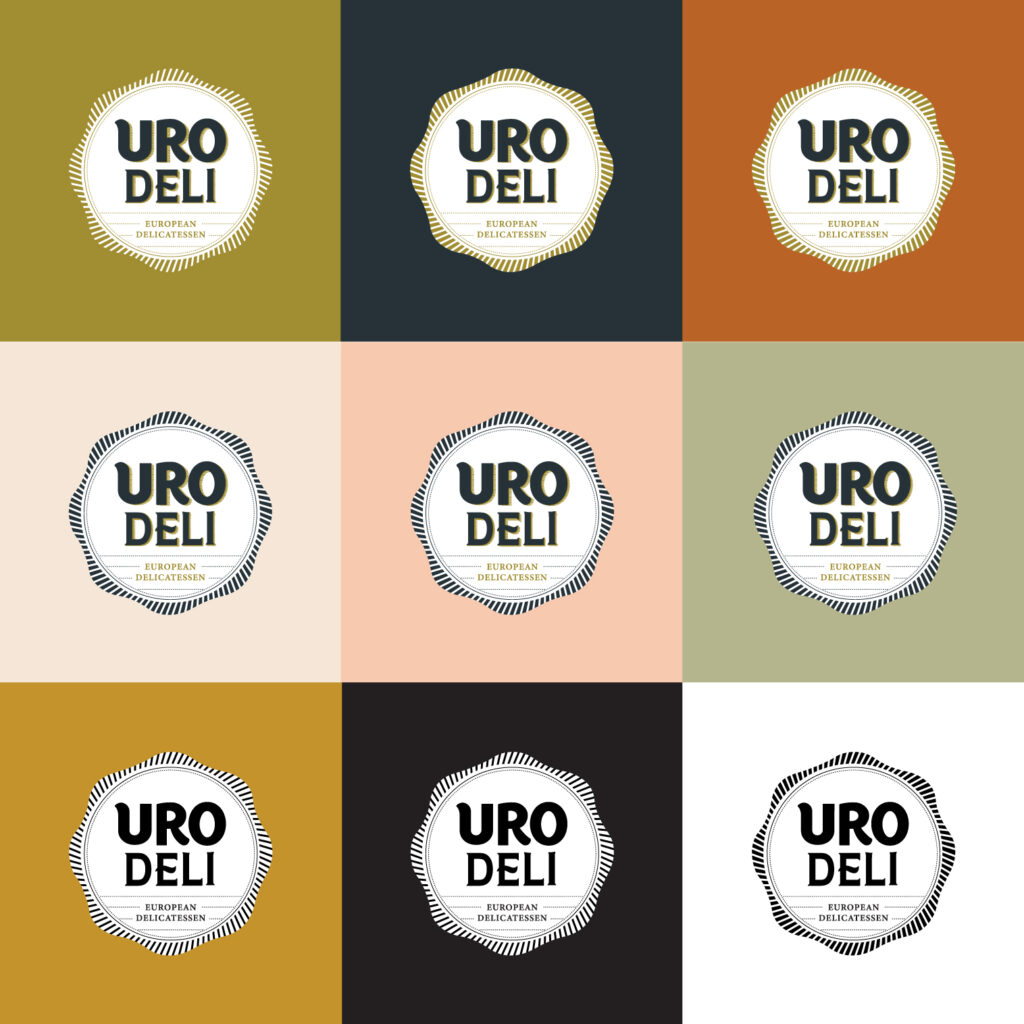
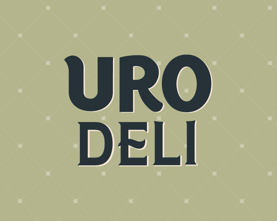
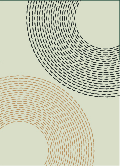
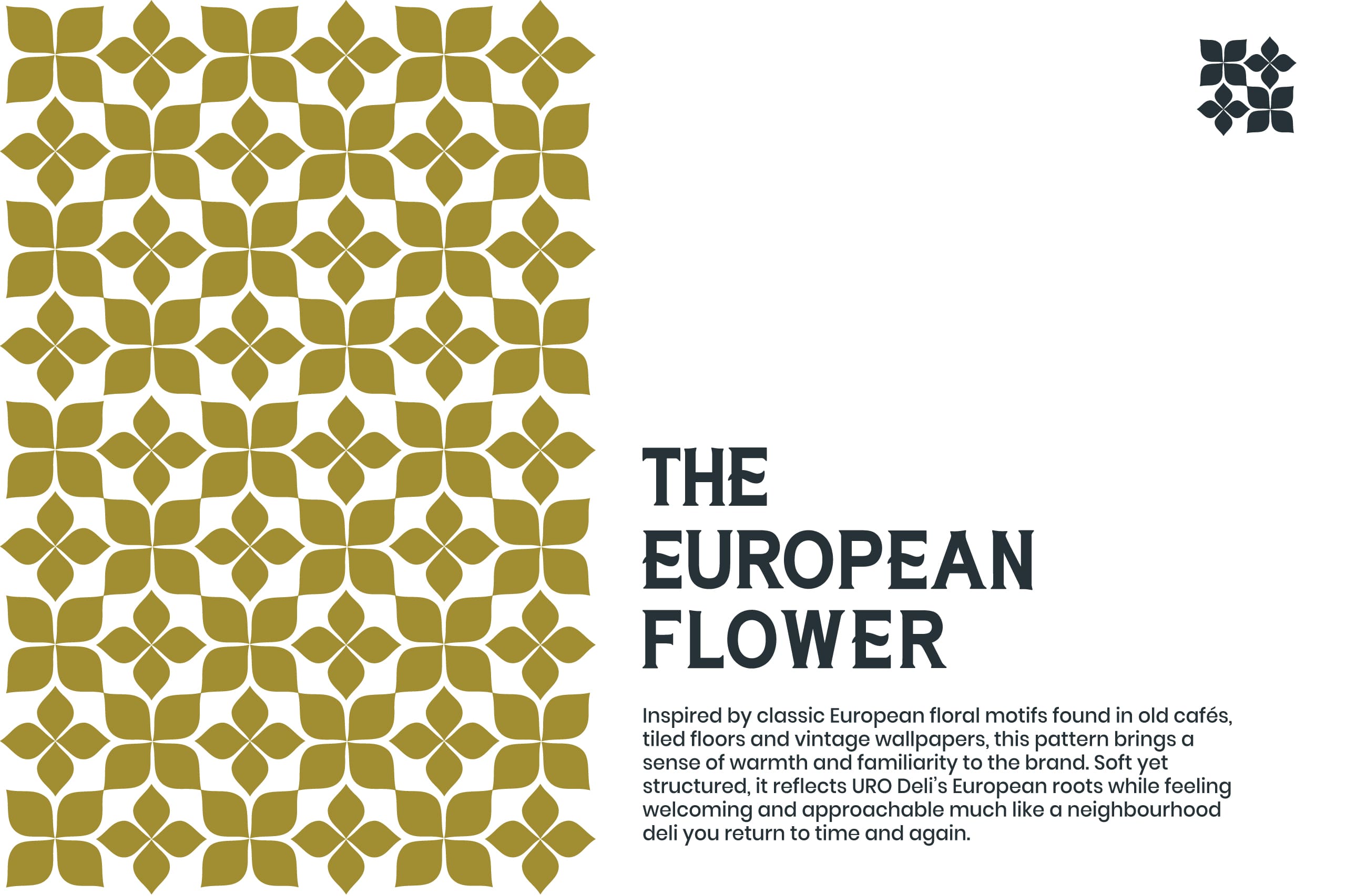
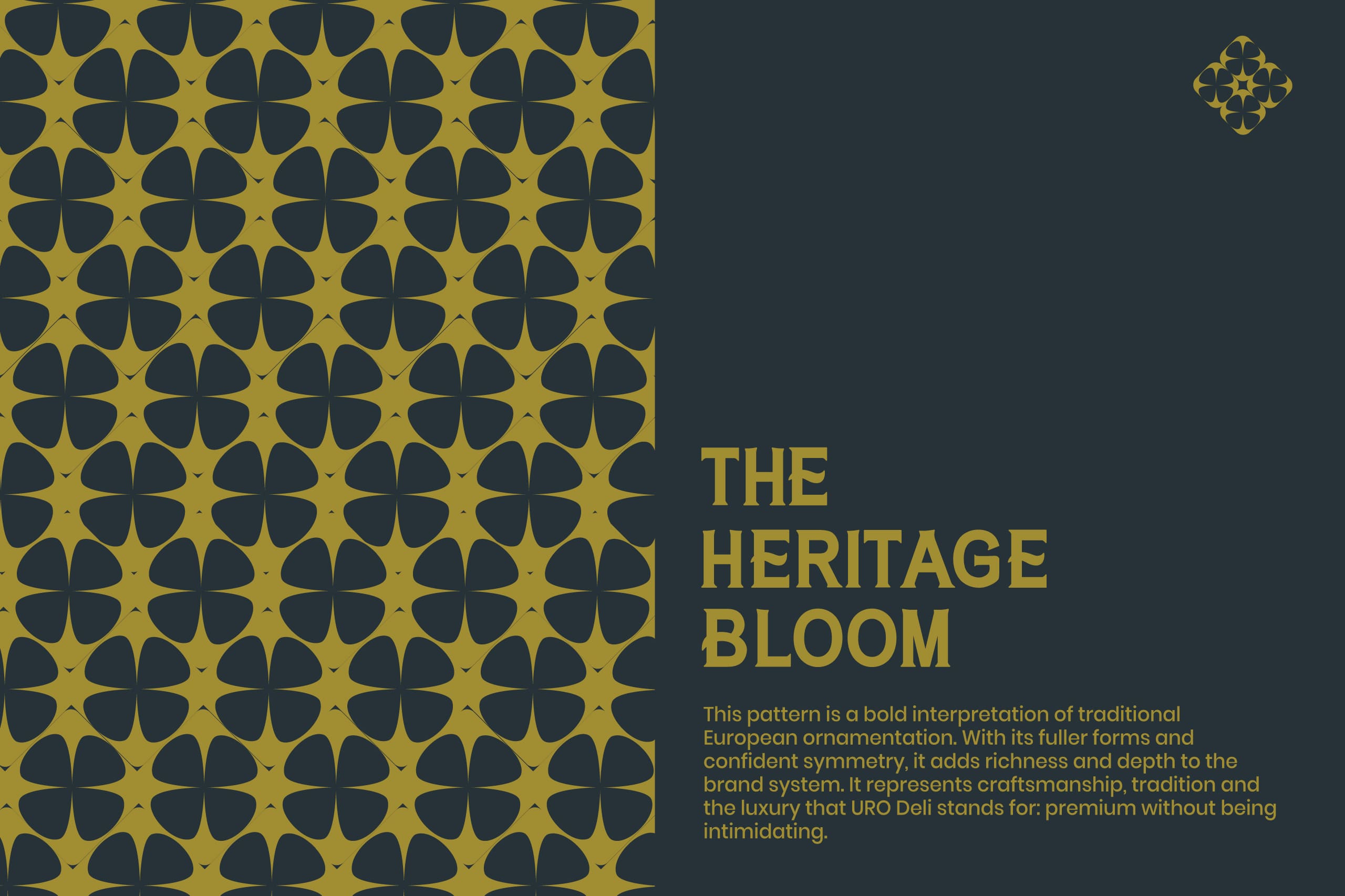
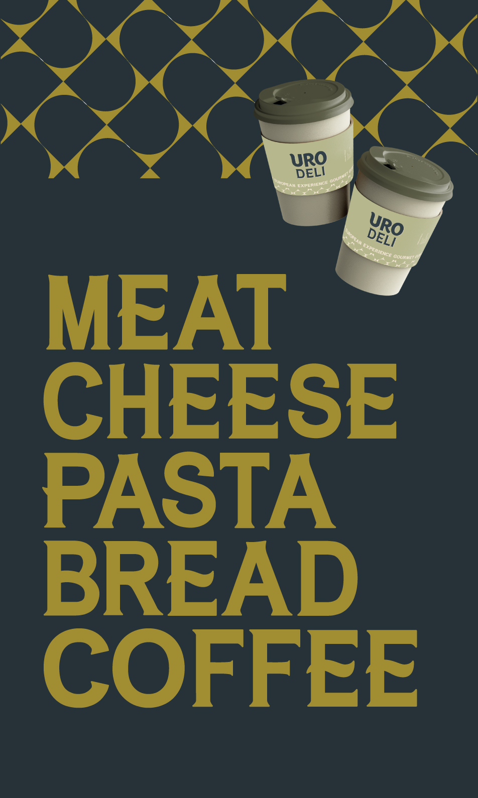
Building on this foundation, we created a refined colour palette, typography and layouts that reinforce trust and continuity while signalling a confident generational shift. To enrich the brand world, we introduced custom assets inspired by classic European tiles, reinterpreted through contemporary geometry. These subtle elements add heritage, rhythm and recall across packaging and communication without overpowering the brand.
Result
Uro Deli now stands as a brand that successfully bridges generations.
Uro Deli now stands as a brand that successfully bridges generations. The evolved identity allows the second generation to lead with their own voice, while preserving the equity built over time. The logo transformation became a symbol of continuity, not disruption, signalling growth without alienation. Most importantly, the brand now has a foundation that can scale across formats, audiences, and experiences, while remaining true to its legacy.
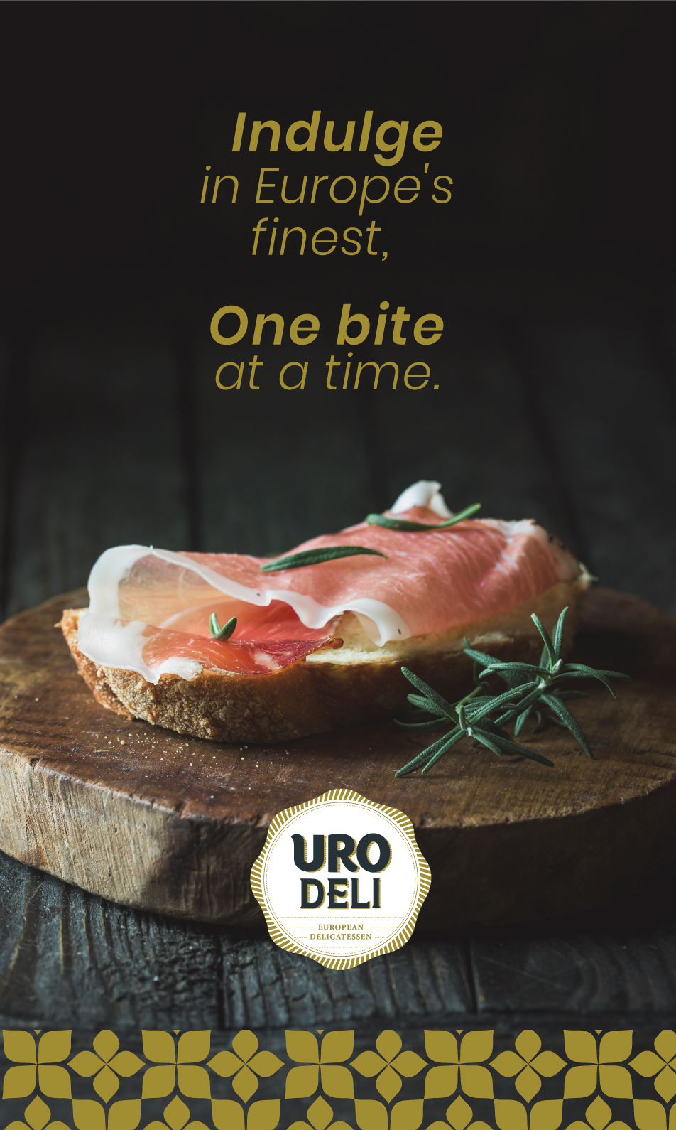
Where craft, memory, and modern living meet.
A brand evolution designed to be felt, not forced.