The challenge was to transform Myraveda from a small Amazon storefront into a scalable brand system capable of supporting rapid growth in a highly competitive digital marketplace.
When Myraveda approached us just before the pandemic, the brand existed with just five SKUs on Amazon. But the ambition was far greater. As global interest in Ayurveda and clean beauty surged, the brand was preparing to expand rapidly and needed a visual identity that could grow with it.
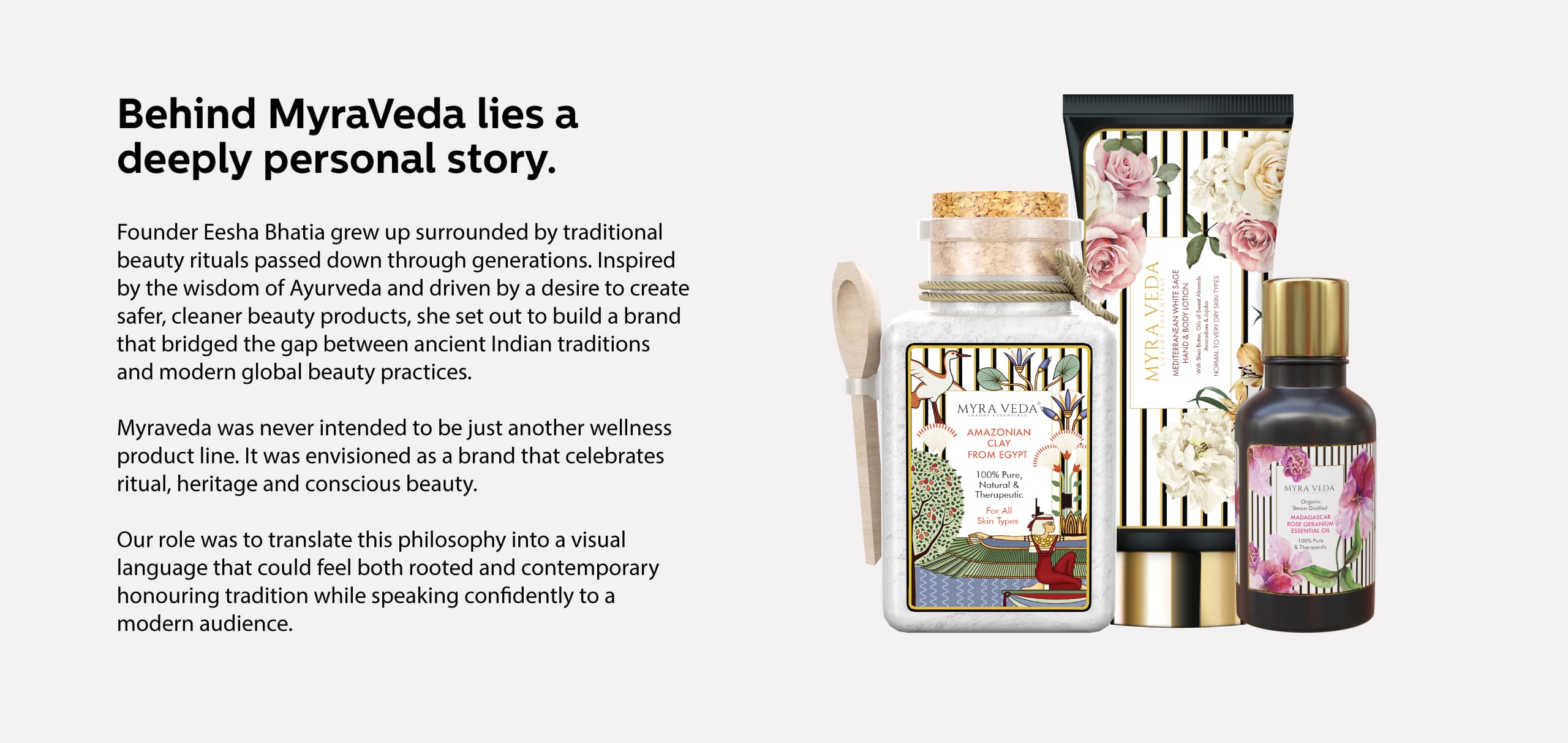
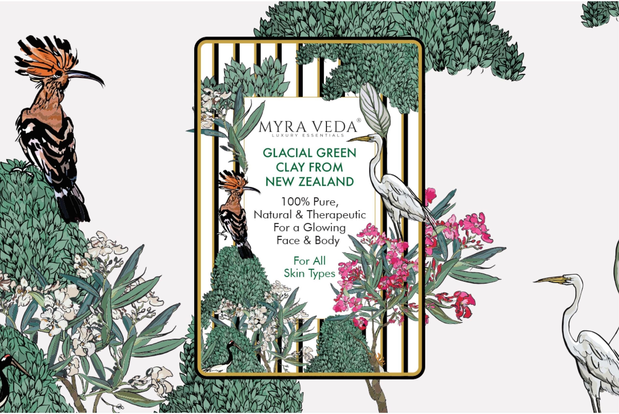
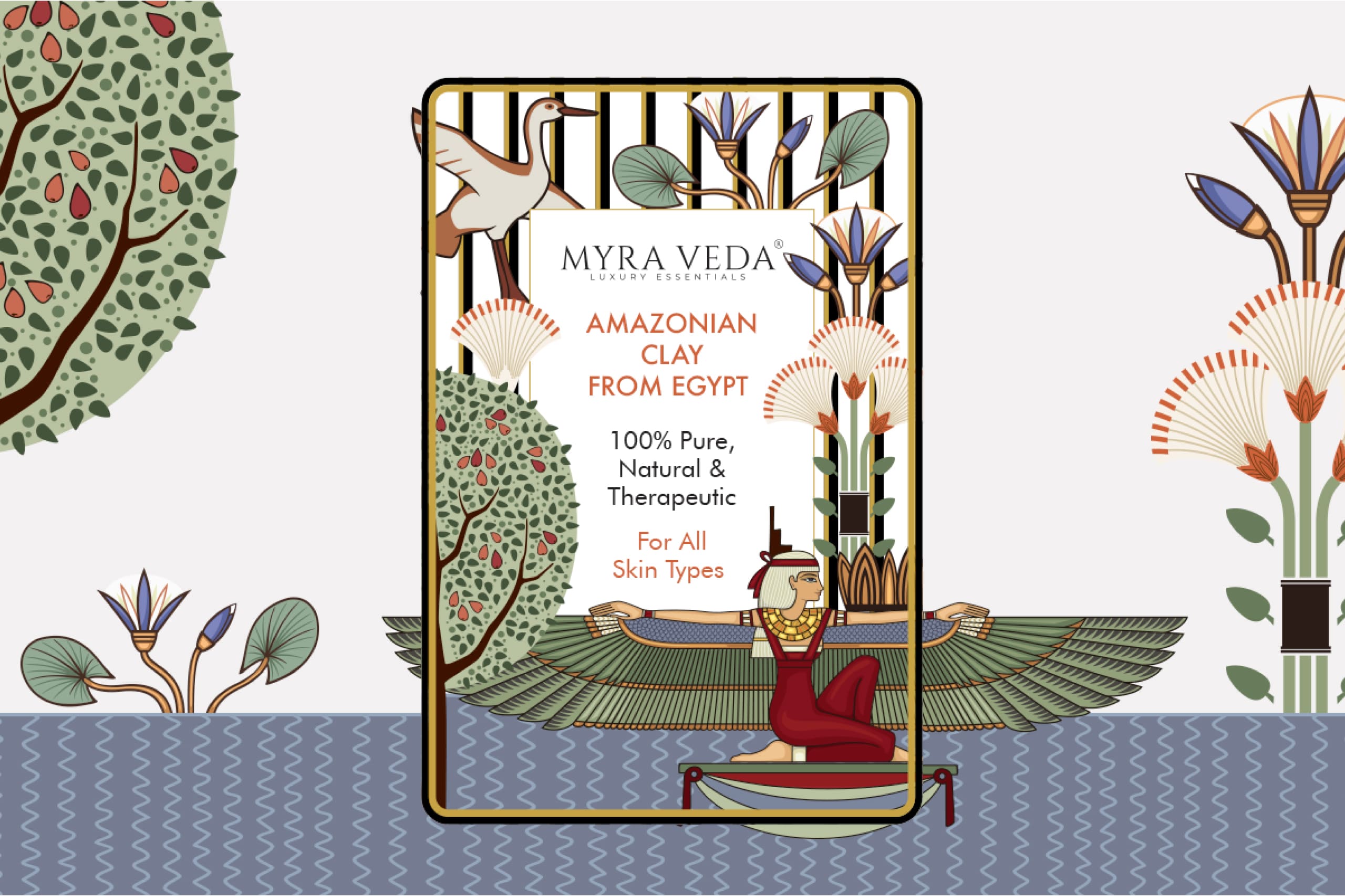
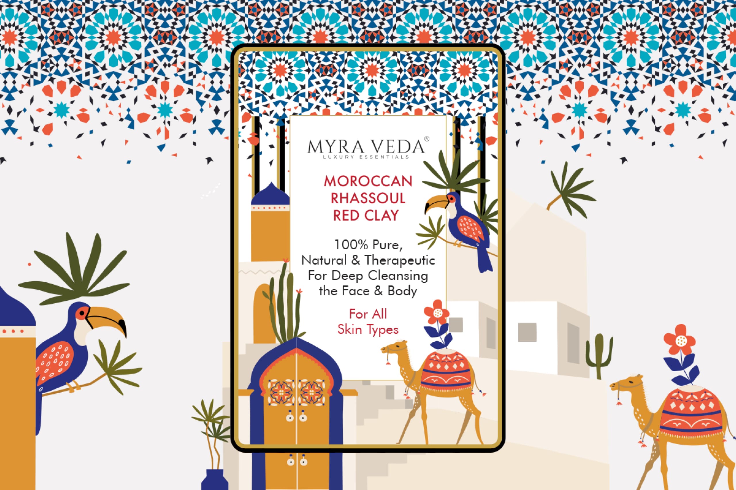
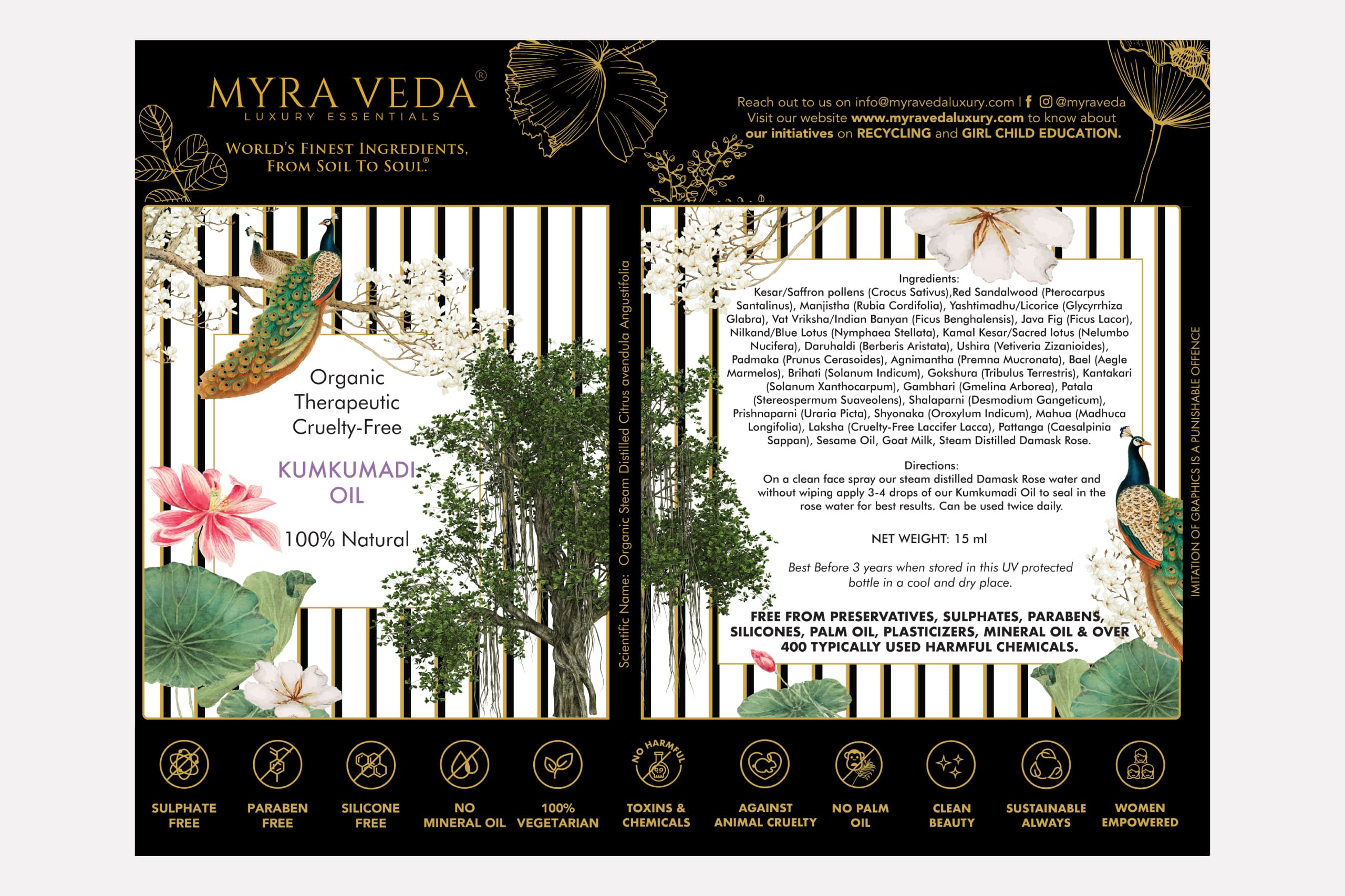
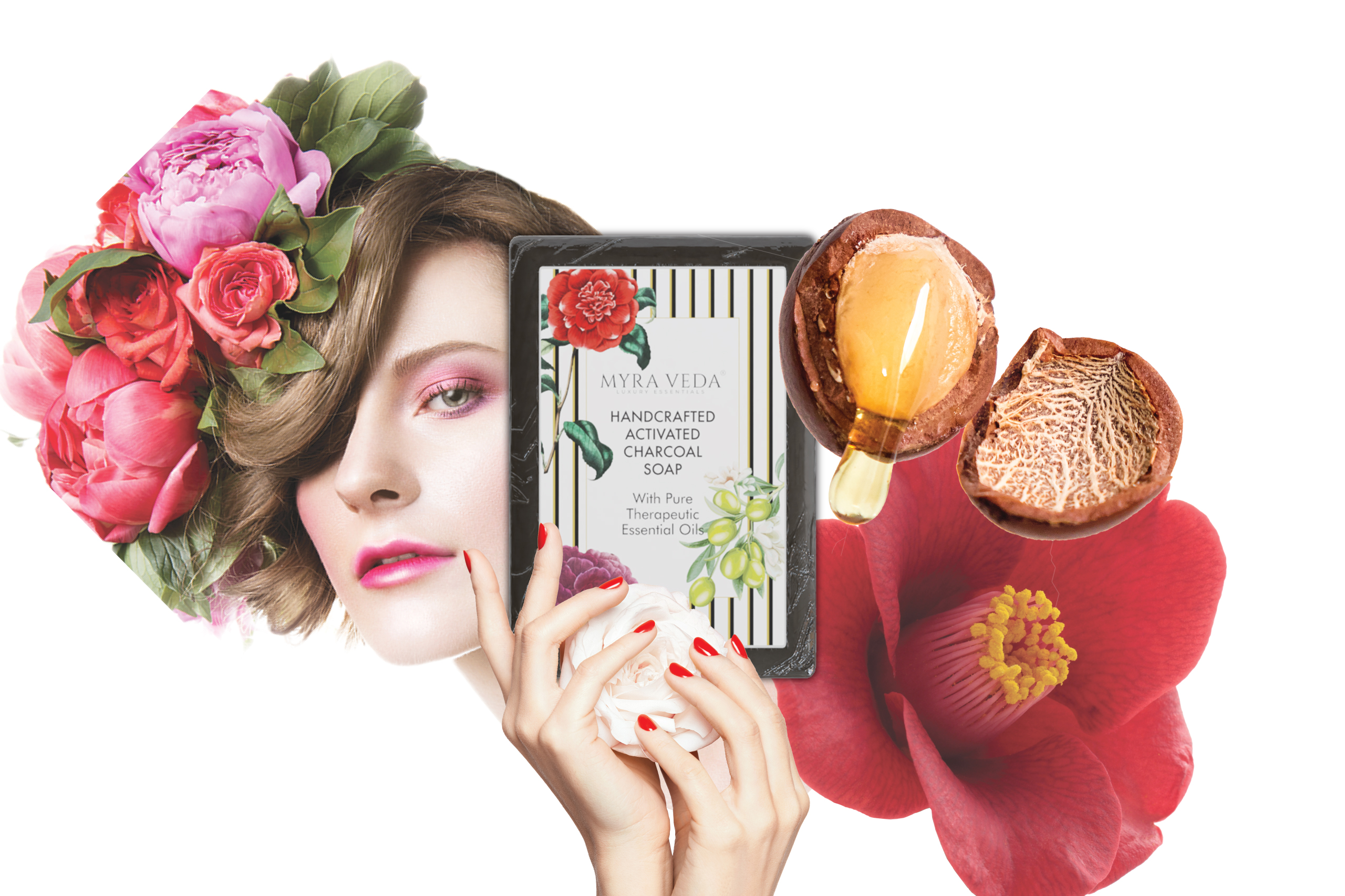
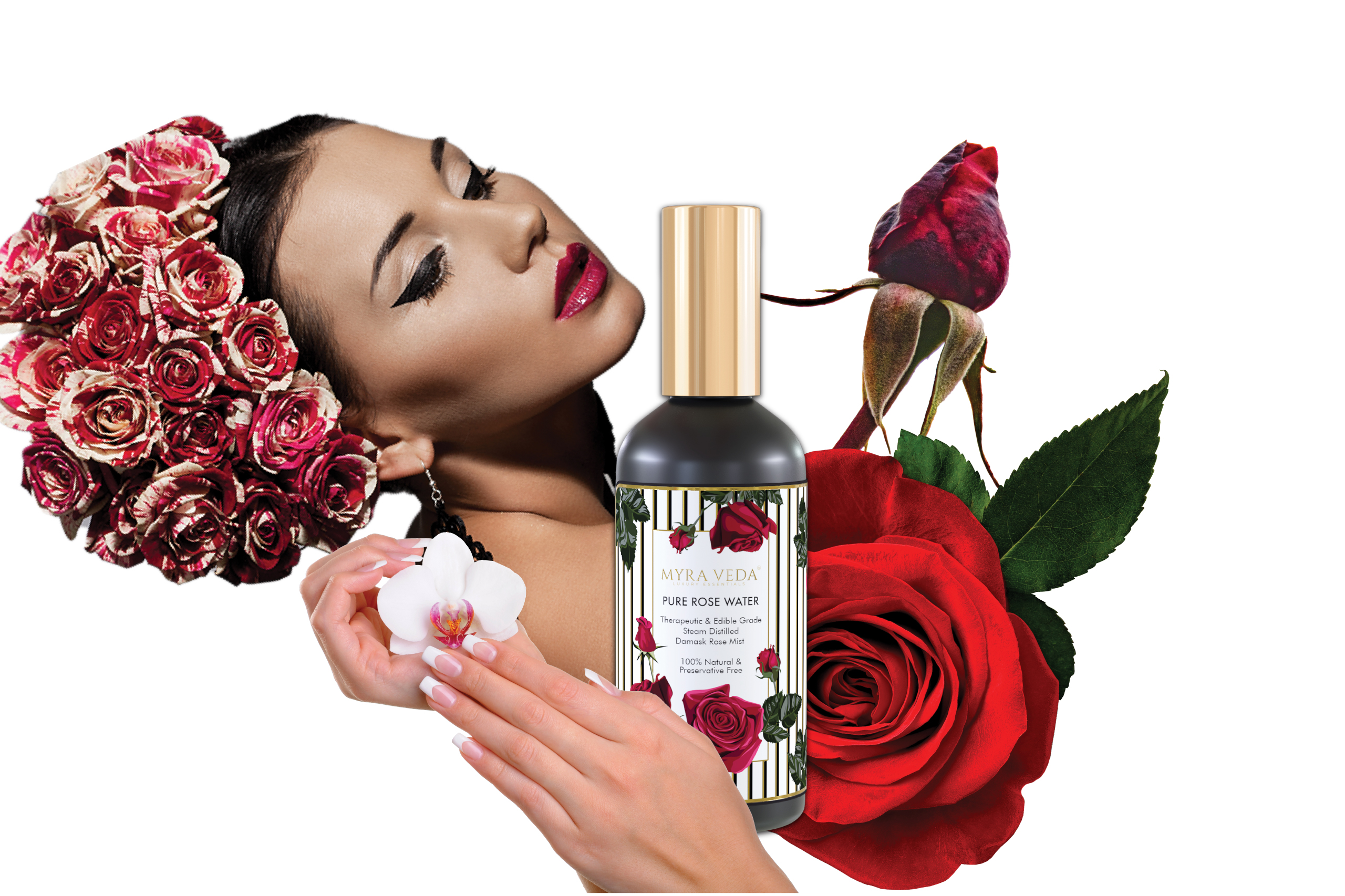
At the same time, Myraveda already had a recognisable visual signature, black and gold line illustrations set against a white background. The task to evolve it into a cohesive system that could support a much larger product portfolio.
Equally important was the environment in which the brand lived. On platforms like Amazon, where products compete within dense grids and rapid scrolls, visual clarity and distinction become critical. The brand needed to stand out instantly while maintaining consistency across an expanding range of products.
Goal
The goal was to translate Myraveda’s existing visual cues into a cohesive brand language that could create strong recognition across an expanding product range.
We began by building upon the brand’s distinctive illustration style, developing it into a broader packaging and visual system designed for clarity and impact in digital marketplaces. At a time when the wellness category leaned heavily toward minimalism, we chose a more expressive direction.
By amplifying colour, composition and visual richness while retaining the elegance of the brand’s black and gold illustrations, we created a visual identity that felt both familiar and striking.
Result
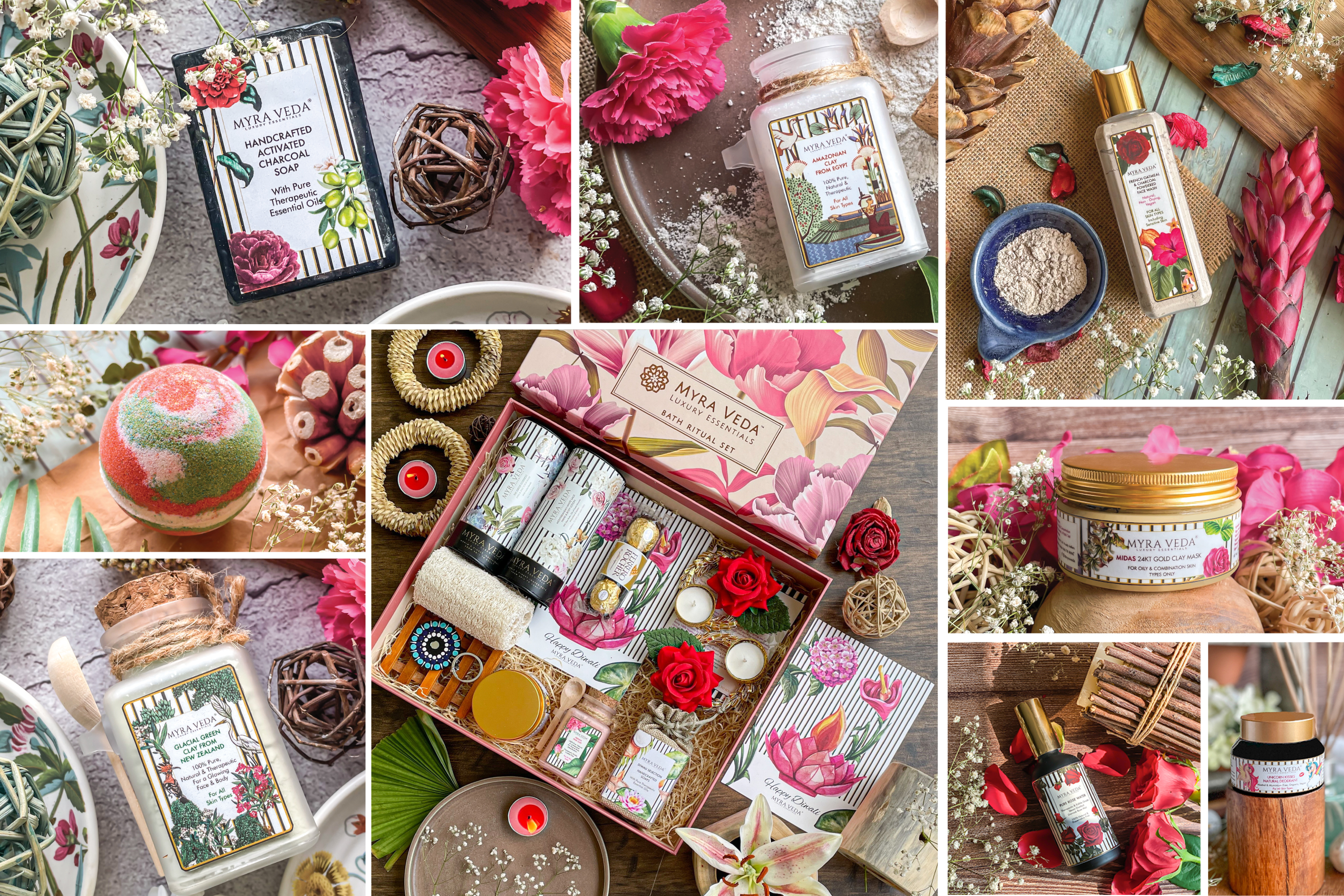
Over the course of two years, Myraveda evolved from a five product Amazon store into a rapidly growing wellness brand with a portfolio of more than 100 SKUs.
As the product range expanded, the brand maintained a clear and consistent visual presence across its growing catalogue. The design system enabled new products to be introduced seamlessly while preserving a strong sense of recognition across the entire range.
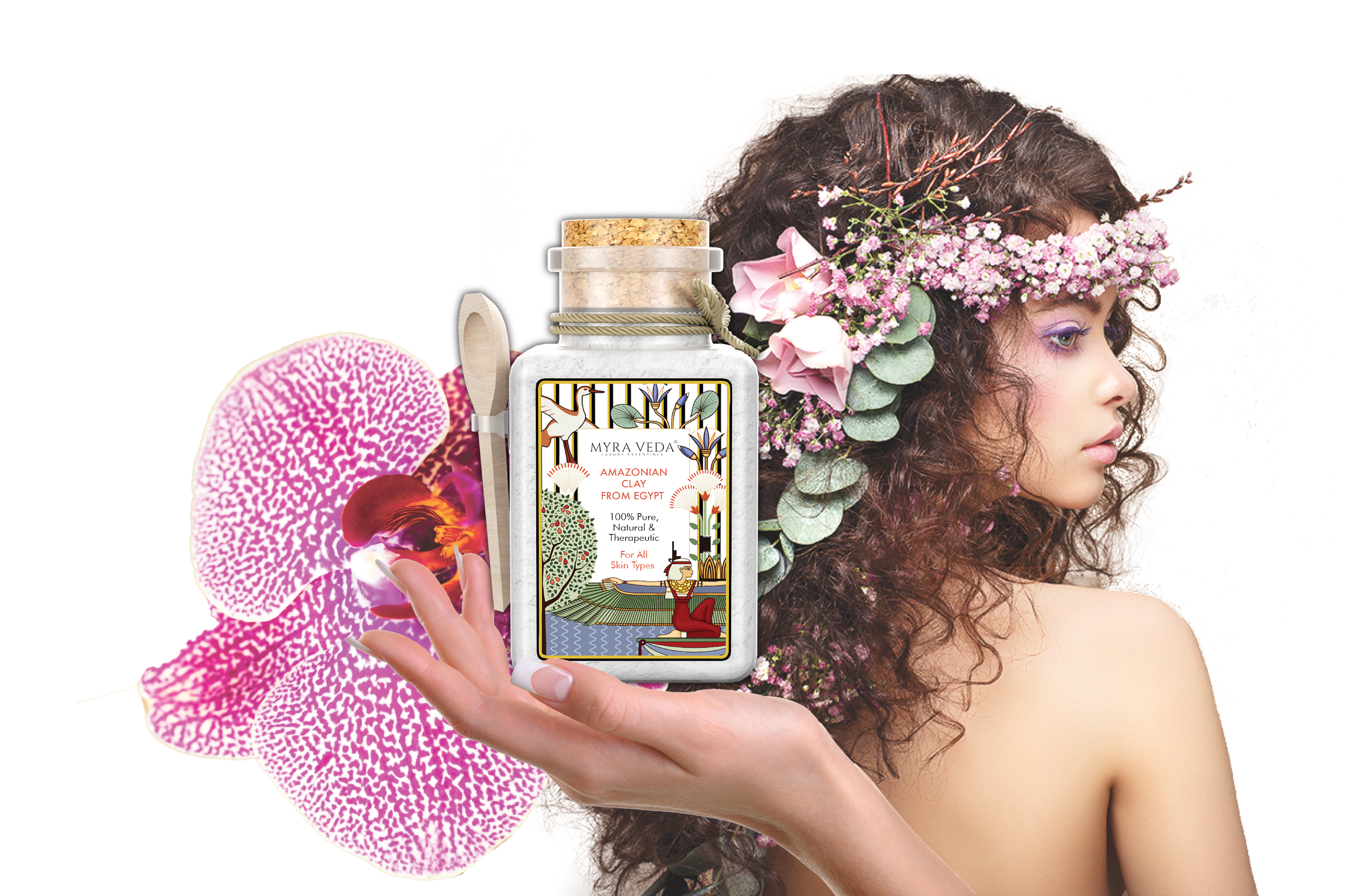
Beyond packaging, the visual language extended into Amazon banner pages, listing imagery and digital storefront assets, creating a cohesive and memorable presence across every customer touchpoint. In a category often defined by quiet minimalism, Myraveda built a brand presence that felt vibrant, confident and unmistakably its own