Britannia approached us to rethink their existing Come Alive range, beginning with the Dahi packaging.
The current design felt cluttered and visually flat. A mascot element, although distinctive, was too small to reproduce effectively across multiple SKUs. Limitations in print technology and paper stock further impacted clarity and finish, making the pack appear compromised in execution.
Most importantly, the packaging lacked invitation. It did not feel fresh, premium, or compelling enough to encourage trial in an increasingly competitive dairy segment.
The core question was: How can an everyday staple feel renewed without losing familiarity?
Goal
The objective was to explore how a staple dairy product could appeal to a new generation of consumers across both premium and mass segments.
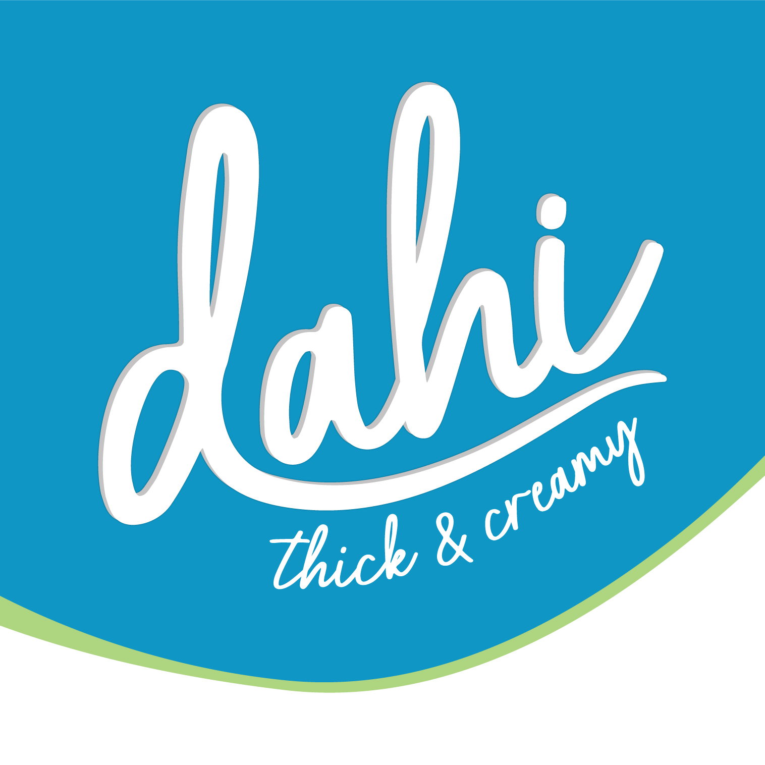
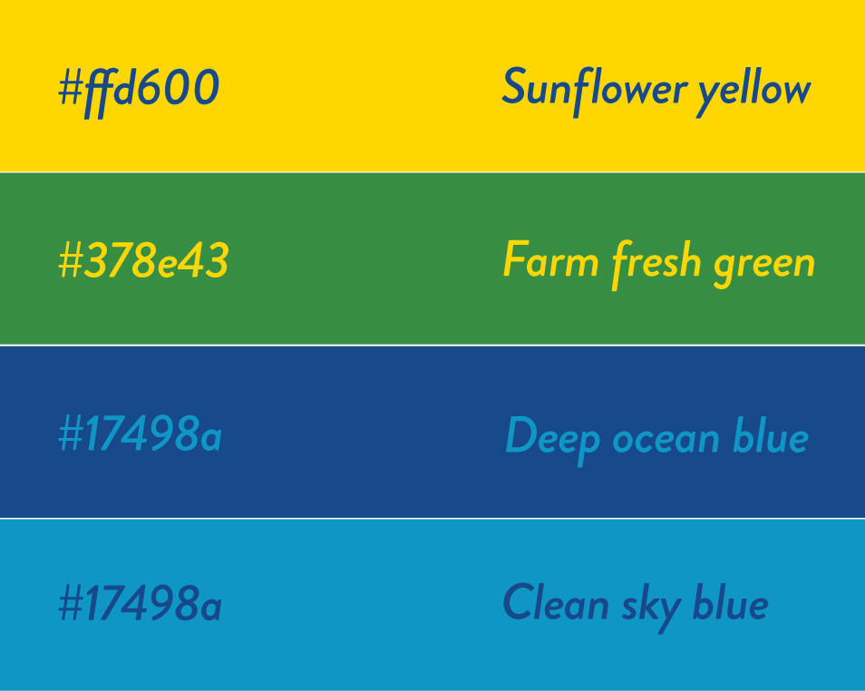
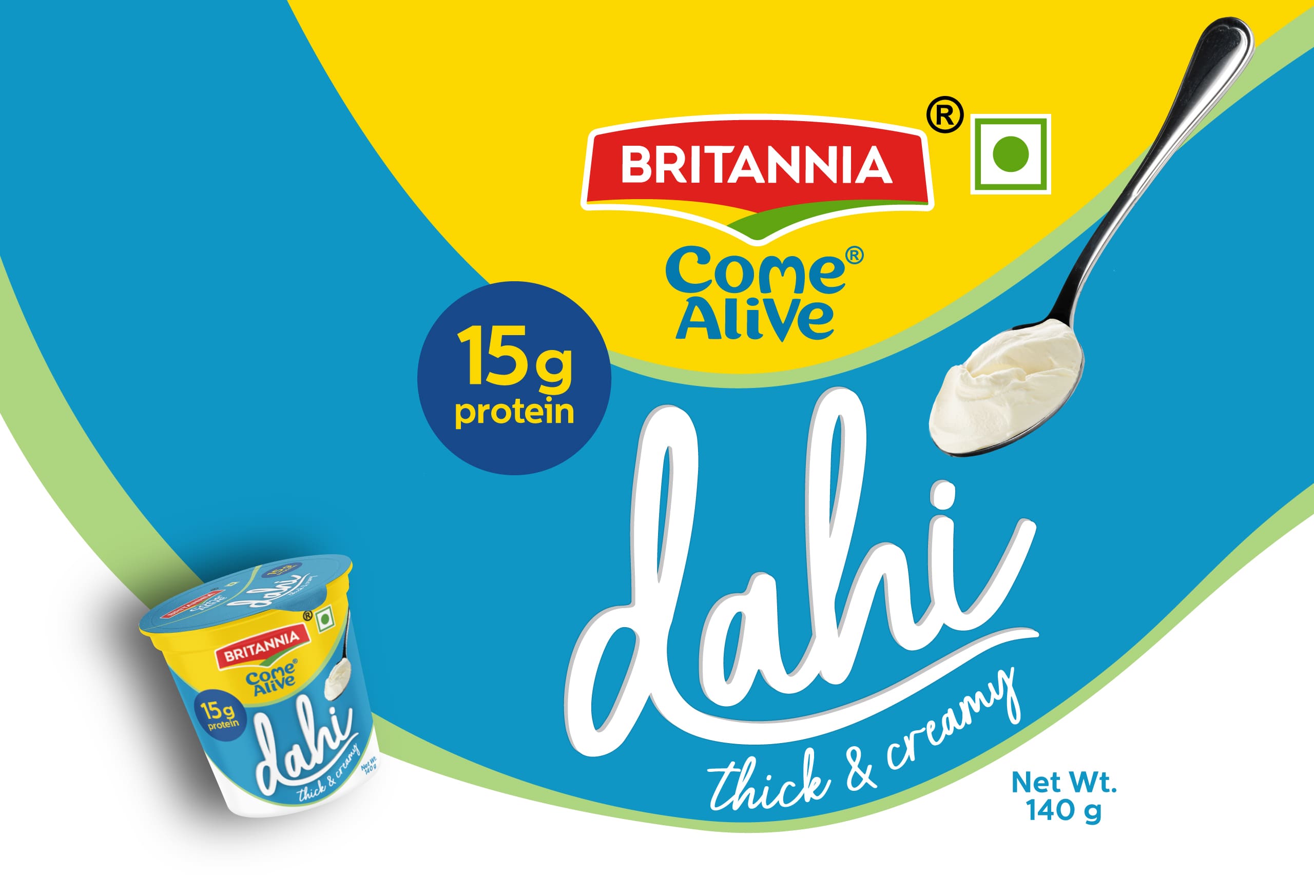
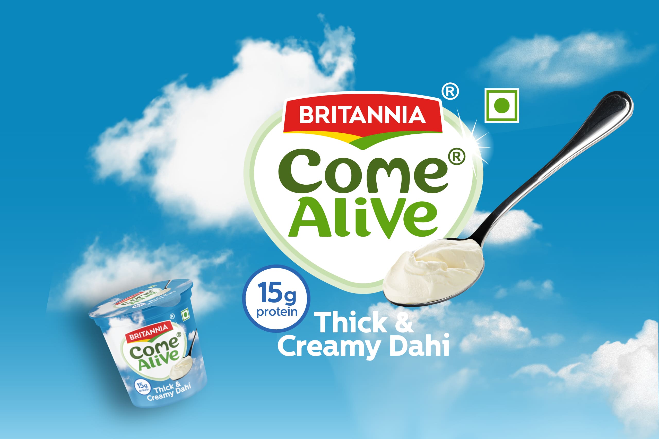
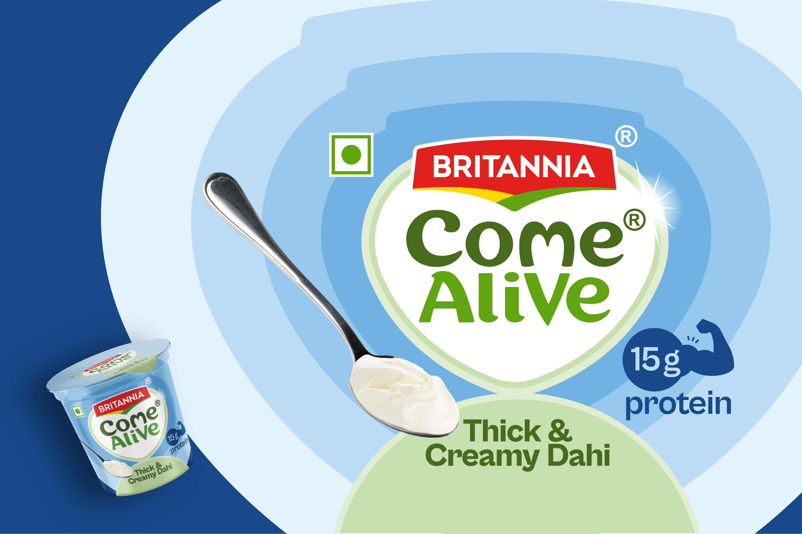
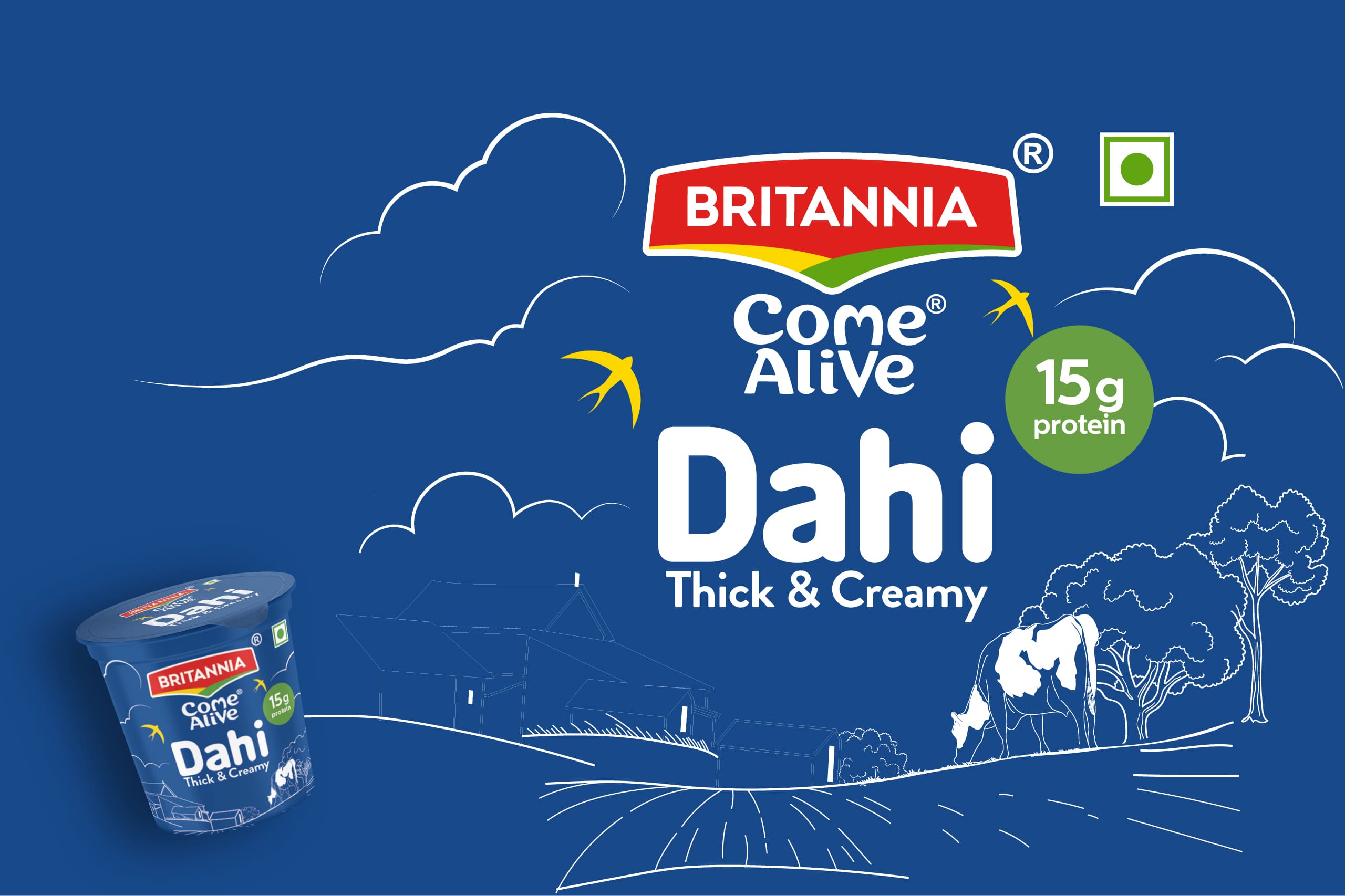
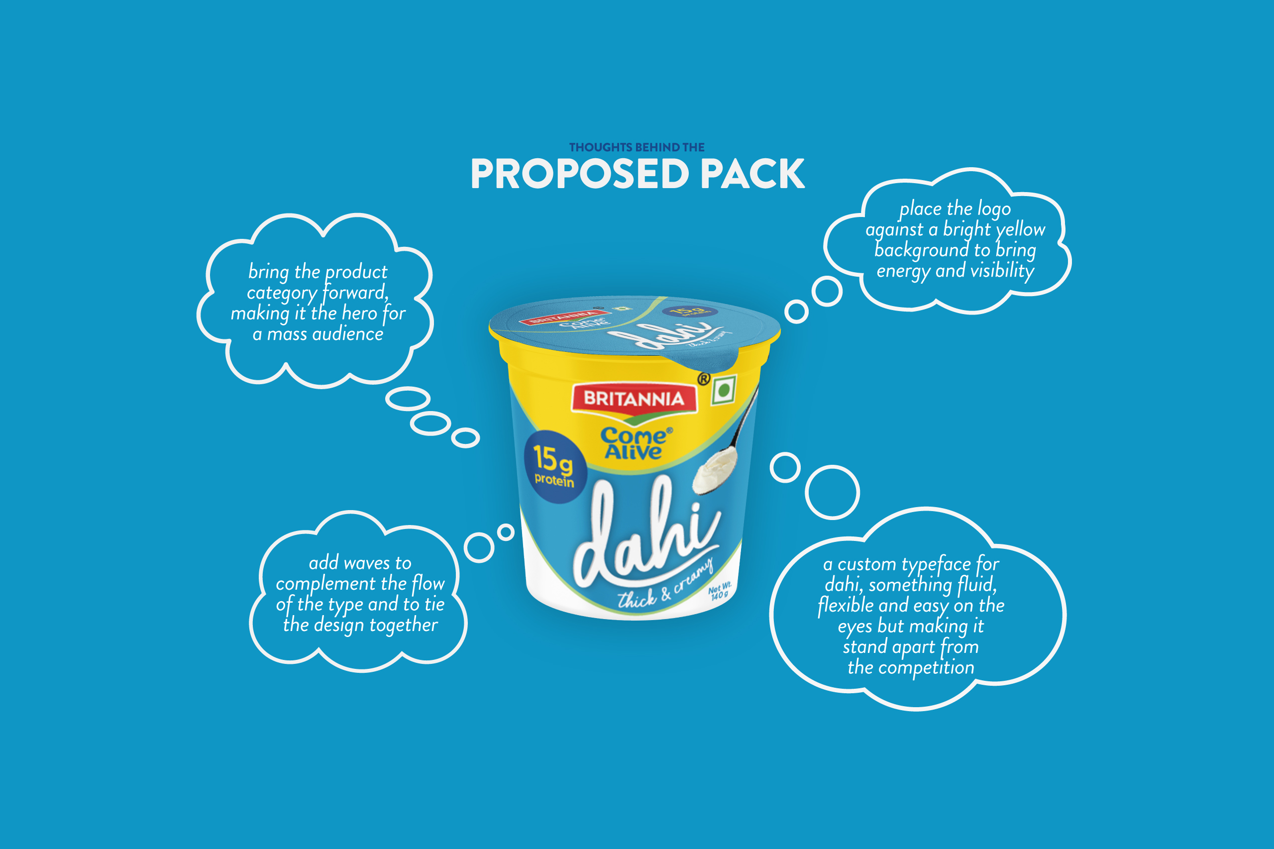
We examined both conventional and unconventional routes. These ranged from a storytelling direction rooted in origin, farms and freshness to a graphic-forward approach where the heart symbol from the Come Alive logo became the hero. We explored a metaphor-led concept using clouds and flow to express the feeling of “coming alive,” alongside a more direct and conventional route that placed Dahi at the center, elevating it through custom typography and strong color contrast to make it bold, inviting and instantly noticeable.
The goal was not simply to redesign a pack, but to present leadership with multiple strong perspectives on how a staple category could feel contemporary, relevant and competitive against dominant players.
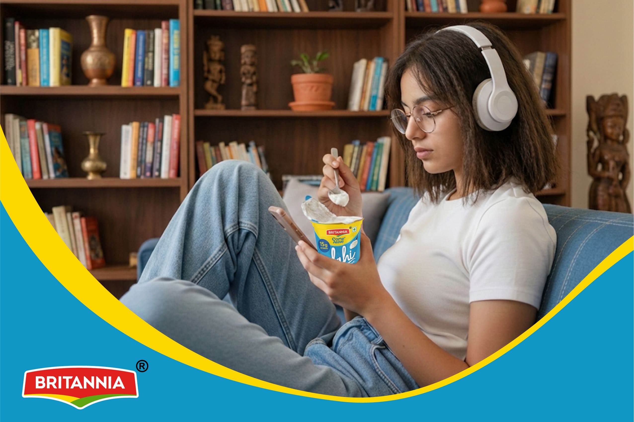
Another key consideration was digital behavior. How would the pack stand out not just on shelves, but also in the fast-scroll environment of quick commerce platforms where attention spans are minimal and decisions are instant.
Result
Multiple design directions were developed, keeping print feasibility, SKU scalability, and visual clarity at the forefront.
Some routes made the sub-brand the hero, while others placed the product category firmly at center stage.
Each route demonstrated how a legacy product could evolve from cluttered and flat to confident and contemporary.
Where craft, memory, and modern living meet.
A cleaner, sharper expression of everyday freshness.